


The login page or the login form page is an important page of your SaaS website but probably not the most important one. The reason is that the users have already signed up for your SaaS company or product if they need to log in. This page will help you to design the best login form for your website.
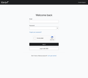
As you can see from all the examples above, you can detect some strategies when it comes to designing your login page. First of all, having only your login form on your page, nothing else. The goal of that strategy is to have the user to focus on the login form only and not on any other links/sections/parts of the website. From there, some websites in our examples go even further. In most cases, they remove the top navigation but also remove the logo of the company (see Kissmetrics and Instapage).
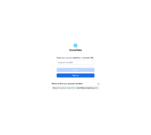
When it comes to the login form itself, most forms are built the same way with two fields, the first one is for the email or username and the second one is for the password. This is mostly true except for some companies that use only one field. For example, ActiveCampaign and Zendesk ask for your account URL and once you click the call-to-action button you get redirected to your account and then you have to log in. Another possibility is that the form is separated in two steps. In the first step, the form asks for the username and in the second step, the form asks for the password. That seems tedious but it might the only possible way for technical reasons e.i. how the SaaS or app was built.
We hope these simple tips and strategies will help you to create the best login form but also the best login page design.