
From some of the most popular SaaS websites, I selected 12 signup pages that I believe use interesting strategy to increase the number of users to their services.
A new (or not so new) trend in signup forms is to use the minimum number of fields to not scare/annoy/bore your user. The bare minimum information that you require to create an account for a user could be an email and a password or a name, an email and ask to create a password in the next step.
The other big trend that we have is to remove all UI and anything that could take the focus of your user off the signup form. It’s the same process as if you build a landing page. The user should only be able to do one action, in this case, sign up to your service.
ActiveCampaign

The first step of ActiveCampaign’s signup form is quite simple with only two fields. Once you click on Create Account, you will be redirected to your dashboard with a popup to set your password and get started. The goal of asking less information in the first step of the form is to increase the conversion of it. Another element is the two testimonials on the right side of the form. If a user is not quite sure yet, maybe some recommendations from other users will help.
Basecamp

Basecamp has a simple signup form with only four fields. Something great with this form is the displayed number of companies that signed up in the last week which can only give more confidence in the product.
FreshBooks

To reduce the risk of losing a potential user, FreshBooks removed their default UI and only kept a basic form. This way, the user cannot go on any other pages. The only action possible is to sign up (or log in). It’s a popular strategy used by many SaaS including the other examples below.
Freshdesk

As FreshBooks above, Freshdesk removed most of their UI to only keep their logo (which is clickable) and add their phone number on the top too. Notice the repetition in the title of the form and the label of the call-to-action button: It’s free!
GitHub

In the opposite of few examples above, GitHub kept all their UI including their navigation. Also, the steps indicator let you see the whole process which is good. It manages the expectation of your users.
Help Scout

Help Scout removed all their UI to only keep their logo which you can click to go back to the pricing page. There is a box on the right of the form with all the features of the standard plan in case you didn’t come from the pricing page. It can be useful as the signup button is displayed on all pages.
Hootsuite
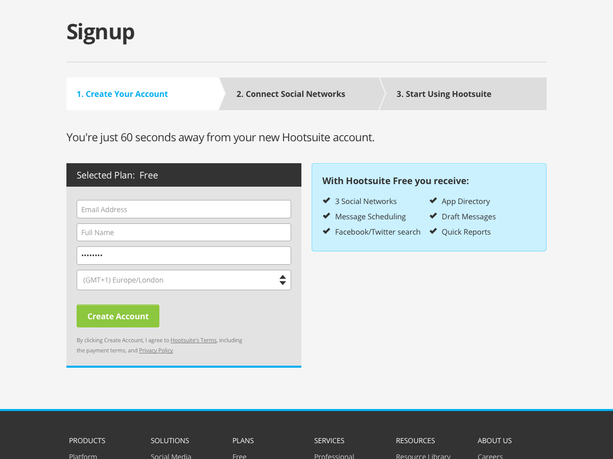
Hootsuite did something bolder than most, they even removed their logo and only kept the title of the page: Signup. The sentence “You’re just 60 seconds away from your new Hootsuite account.” is a great way to manage the expectation of your users.
Instapage

As Hootsuite above, Instapage removed their logo and every other UI from the other pages of their website. The sentence below the form: “Already an Instapage member” is the only way to know from what website this page is.
Kissmetrics

Kissmetrics has a really simple form with some important links below the form.
Shopify

Shopify has the most simple signup form in all our examples. No logo, UI or explanations, only a title, 3 fields and call-to-action button.
Trello

Trello offers the option to sign up with your Google account to speed up the process.
Zapier

Zapier added the option of subscribing to their newsletter in their signup form. It’s the only signup form that I reviewed to have this option.